Shemokmetobitobana
Design + Branding

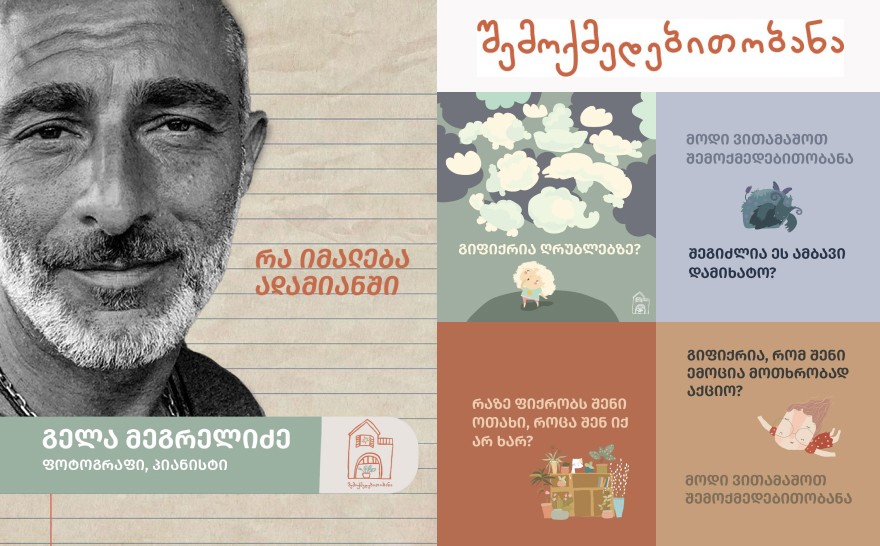
Shemokmedebitobana is a children’s creative studio built around one core idea: kids learn and open up most naturally through play. The program is designed by two friends and tailored to children’s psychology and interests, turning every lesson into a game-like experience that removes pressure and invites genuine curiosity.
Instead of grades, competition, or the need to “prove” something, the studio creates a safe space where children explore emotions, values, and social themes. Each session starts by choosing a main topic based on age and current needs, followed by an artwork selected by the educator (animation, film, story, music, photo, painting, etc.). After a guided group discussion, children express their thoughts through their chosen medium—drawing, sculpting, photography, collage, storytelling, or video—and share outcomes with the group. This structure supports self-awareness, emotional intelligence, confidence, communication, and creative thinking.
Client
Shemokmedebitobana, Georgia
Project Category
Creative & Design
Year
Apr 17, 2025


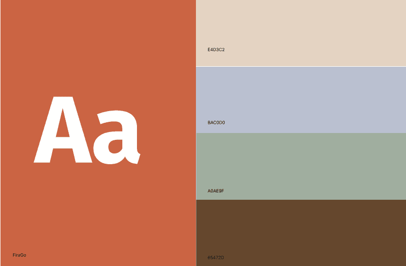
The color palette is built around a warm terracotta #CB6544 as the main identity color it carries the feeling of warmth, energy, and handmade creativity without becoming “too loud.” It’s balanced with a soft, paper-like beige #E4D3C2 that keeps the brand calm and breathable, and a muted blue-gray #BAC0D0 that adds quiet structure and trust. The sage green #A0AE9F brings a natural, grounded tone that reinforces the “safe space” and home-like atmosphere, while the deep brown #65472D anchors the system with depth and stability, making the palette feel mature enough for parents while still gentle and friendly for kids.

Visual style & design system
The overall style is minimal, bright, and airy, with a strong sense of structure so the brand feels organized rather than messy. Key decisions:
simple grid layouts for trust and consistency
soft shapes and friendly spacing to reduce pressure visually
illustrative / icon-based language to reflect creativity without over-decoration
a system designed to scale across: social posts, print materials, worksheets, and signage

For Shemokmedebitobana, I built the brand around a single clear direction: everything should feel homelike - safe, warm, and emotionally comfortable for a child, while still looking organized and trustworthy for parents. I translated that idea into the full visual system, starting from the house-shaped logo and handwritten logotype, and extending it into a calm, warm color palette that feels like a real space rather than a “school identity.”
Beyond the core identity, I shaped how the brand lives in real communication. I defined the overall layout language, spacing, and simple graphic elements so the design stays soft and friendly, not loud or overly commercial. I also developed the visual approach for content: photography focused on the actual session environment: hands, materials, tables, moments of attention, so the studio feels tangible and lived-in. Alongside that, we consistently showcased children’s artworks as a central part of the brand presence, treating their creations as the main visual “voice” and proof of the process. The result is an identity that doesn’t just look nice, it communicates the studio’s philosophy through every detail and every post.

