Pila
Full Brand Identity System

PILA is a premium Georgian bean-to-bar chocolate brand built around purity, craftsmanship, and the authentic aroma of cacao. The core challenge was to create a visual identity that communicates uncompromised quality and natural richness while standing confidently within the international artisan chocolate market.
The process began with deep research into cacao origins, bean-to-bar philosophy, and the emotional language of premium chocolate brands. Instead of relying on typical dark, heavy chocolate aesthetics, the direction focused on warmth, origin, and sensory storytelling. The goal was to treat chocolate not as a commodity, but as an experience something tactile, cultural, and intentional.
Client
Aroma Queen
Project Category
Branding
Year
Nov 29, 2025


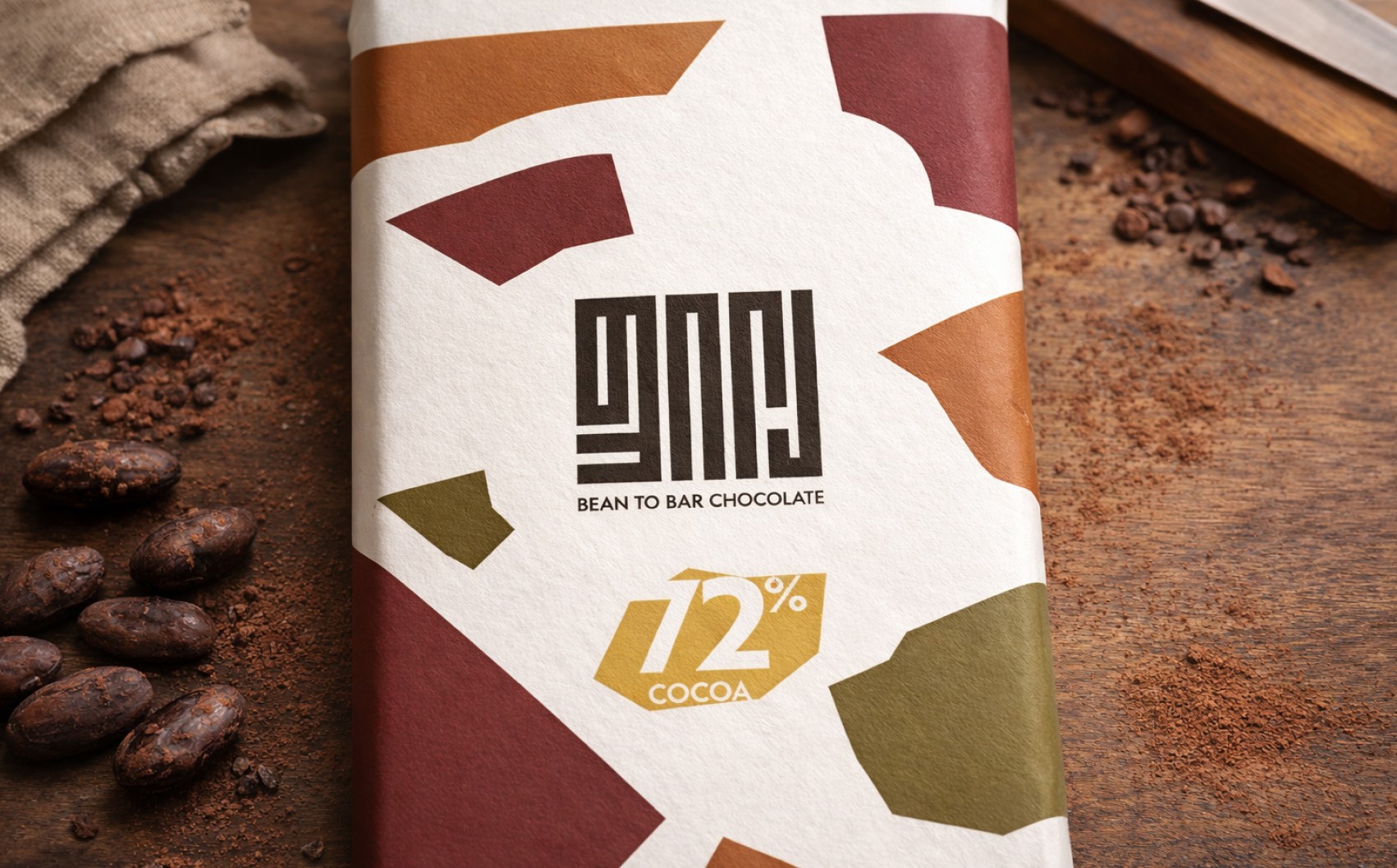

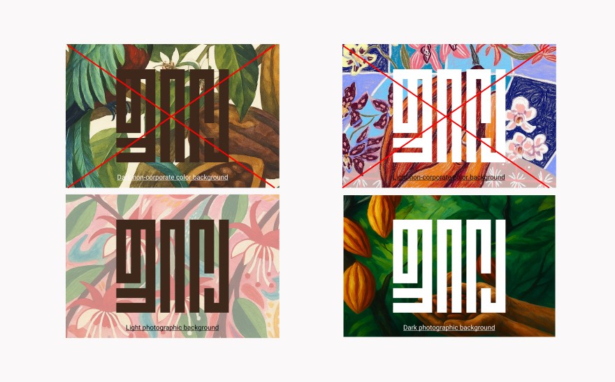
The color palette was built around cacao and earth tones — deep cacao red, roasted amber, golden yellow, and earthy olive — creating warmth without falling into predictable dark brown chocolate clichés. Typography was carefully structured to support bilingual communication: New Hero for Georgian body text (modern and readable) and Bebas Neue for English headlines (bold and confident), ensuring hierarchy without conflict.

Packaging was treated as an experiential object. The front label maintains compositional clarity, while the inside reveals a full-bleed illustration that extends the storytelling beyond the surface. This approach transforms the simple act of opening chocolate into a sensory and emotional moment, reinforcing the brand’s authenticity without complicating production


Throughout the process, every decision was guided by balance — precision and emotion, structure and nature, premium restraint and artistic depth. The result is a cohesive visual ecosystem that scales across flavor variations, gift boxes, print materials, and digital communication, positioning PILA as both a crafted product and a cultural experience


